#Branding/visual design/package design/poster design/Illustration…and more.
Program Design: JOY Piano
Design Concept: This design is inspired by the theme of a music amusement park, utilizing vibrant colors and illustrations to create the primary visual. The program schedule is organized in a clean and straightforward format to improve readability.
Photoshop/Illustrator
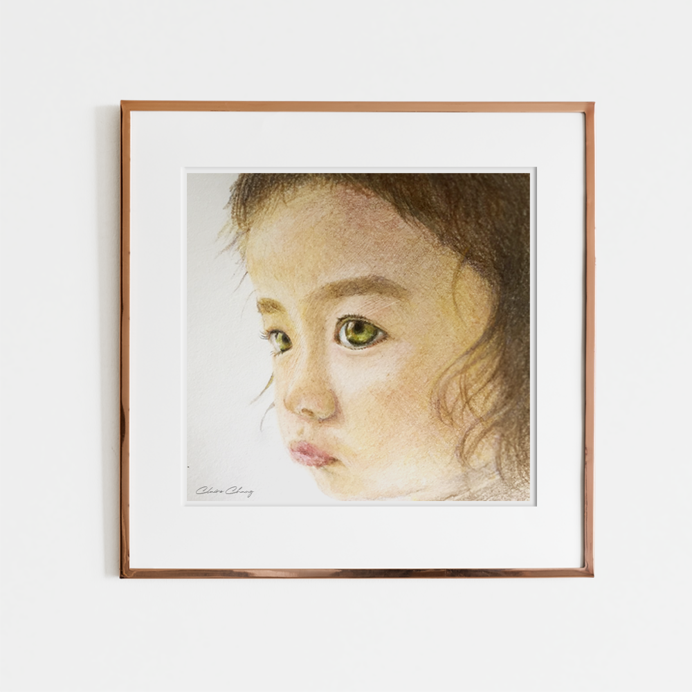
Illustration:
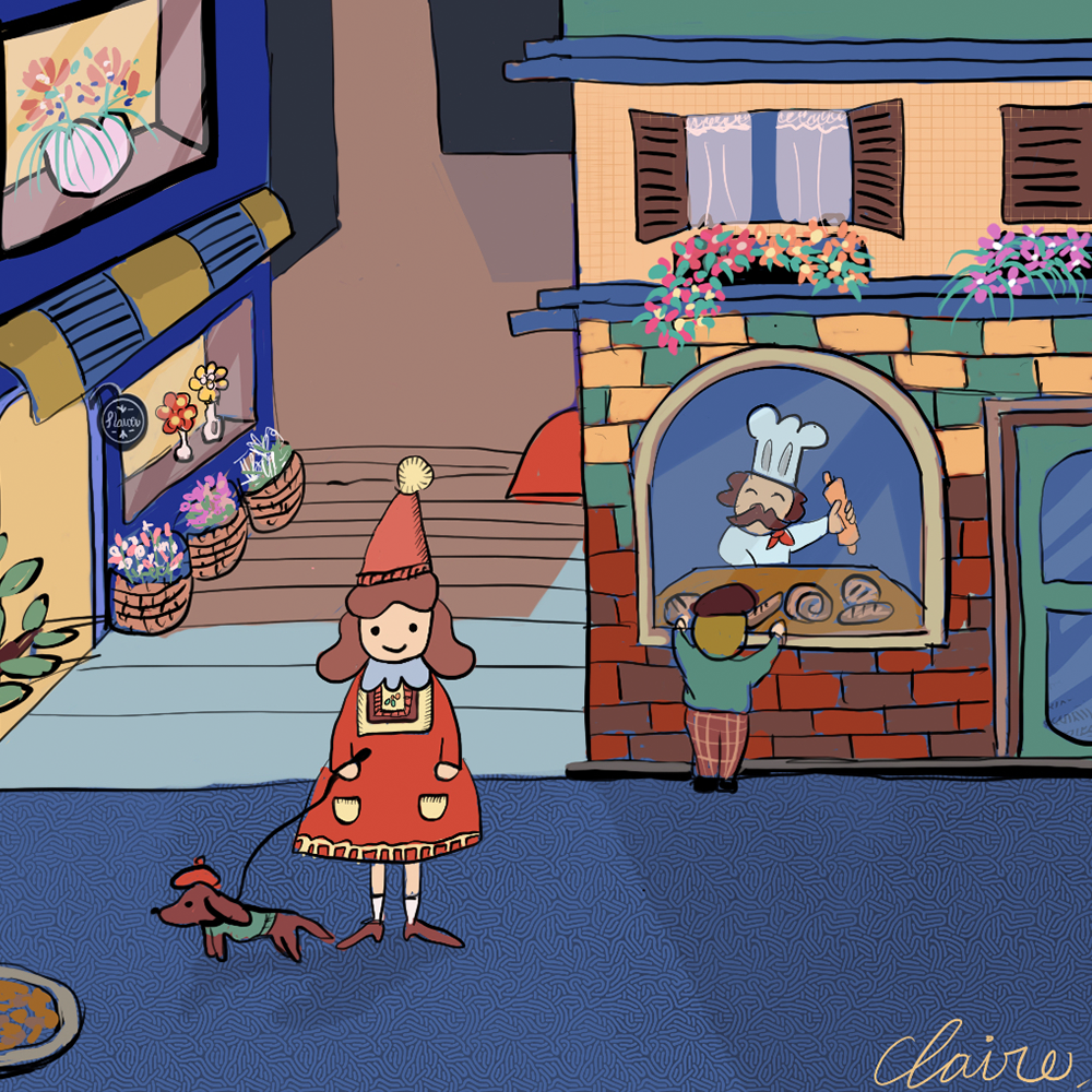
Design Concept: The illustrations are presented in a fairytale style, using soft colors and focused compositions to depict a harmonious family dreamscape.
Procreate
Rebranding:
I’ve had the privilege of working with MOEC for over a year, contributing to their brand evolution. MOEC is a Certified Supply Nation business, dedicated to honoring and respecting the rich heritage, culture, and rights of Indigenous peoples. As part of this collaboration, I have redesigned the original logo and developed extended visual elements to align with and enhance MOEC’s values and brand identity.
Poster Design: JOY Piano
Design Concept: The client requested to include student photos in the poster design, so I designed a collection of children’s photos in the shape of a piano. I chose a contrasting color scheme of pink and black to convey a modern, professional, and joyful image for the client’s performance.
Photoshop/Illustrator
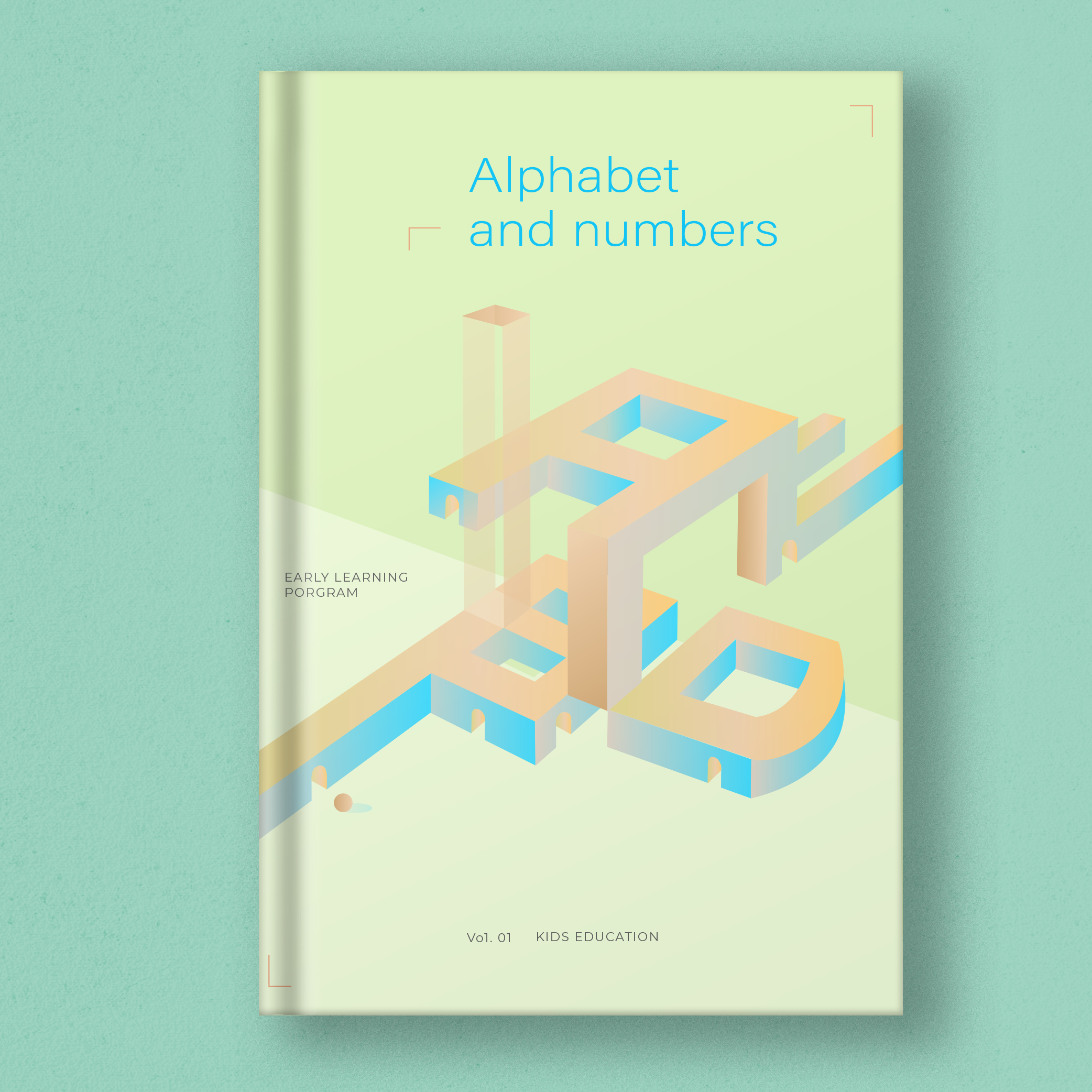
Book Cover Design
Design Concept: I have always wanted to try a more modern approach to designing children’s textbooks, so I experimented with using bright, fluorescent colors to interpret the content. To represent children, I used spheres, and for the 3D abstract architecture, I created multiple entrances for children to explore. The main idea was to convey that learning can take many forms and that children can explore it in their way.
Illustrator
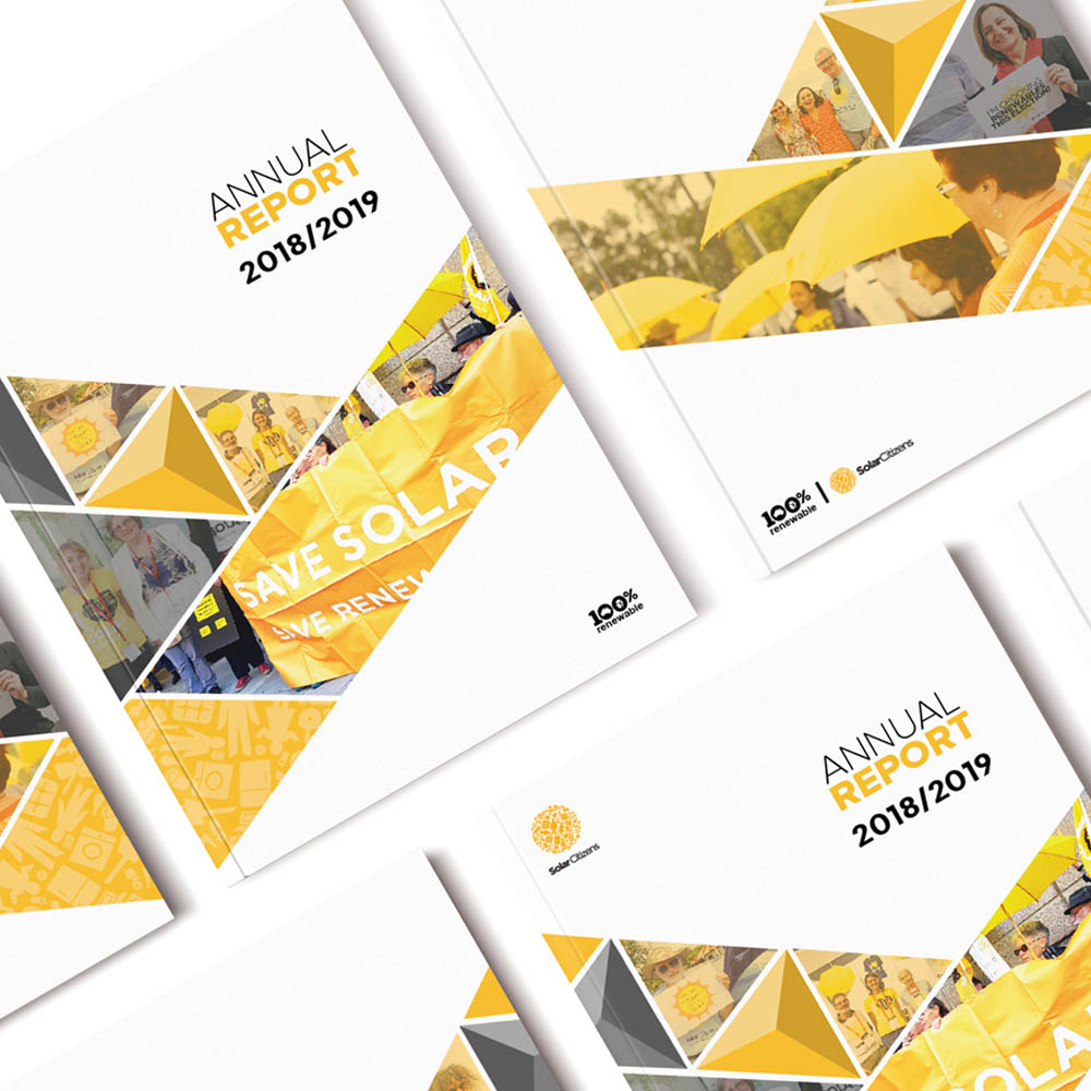
Annual Report Design: Solar Citizen
Design Concept: Solar Citizen’s branding is already well-established, and for this design project, I took inspiration from the brand guidelines to create a variety of shapes and layouts. I used images and geometric shapes to add visual interest, while maintaining a simple and easy-to-read layout for the graphics and text on the inner pages.
Photoshop/Illustrator/Indesign
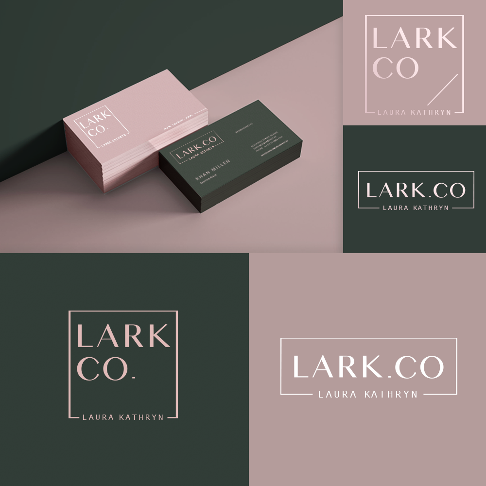
Logo and business card design: LARK CO
Design Concept: LARK.CO is a fashion styling company, and the client requested that the logo design be used for sticker packaging as well. Therefore, I chose a font design that was simple and elegant to convey the desired corporate image. For the business cards, I used Edge Coloring print skills which helped to make the overall corporate colour more complete and prominent.
Illustrator
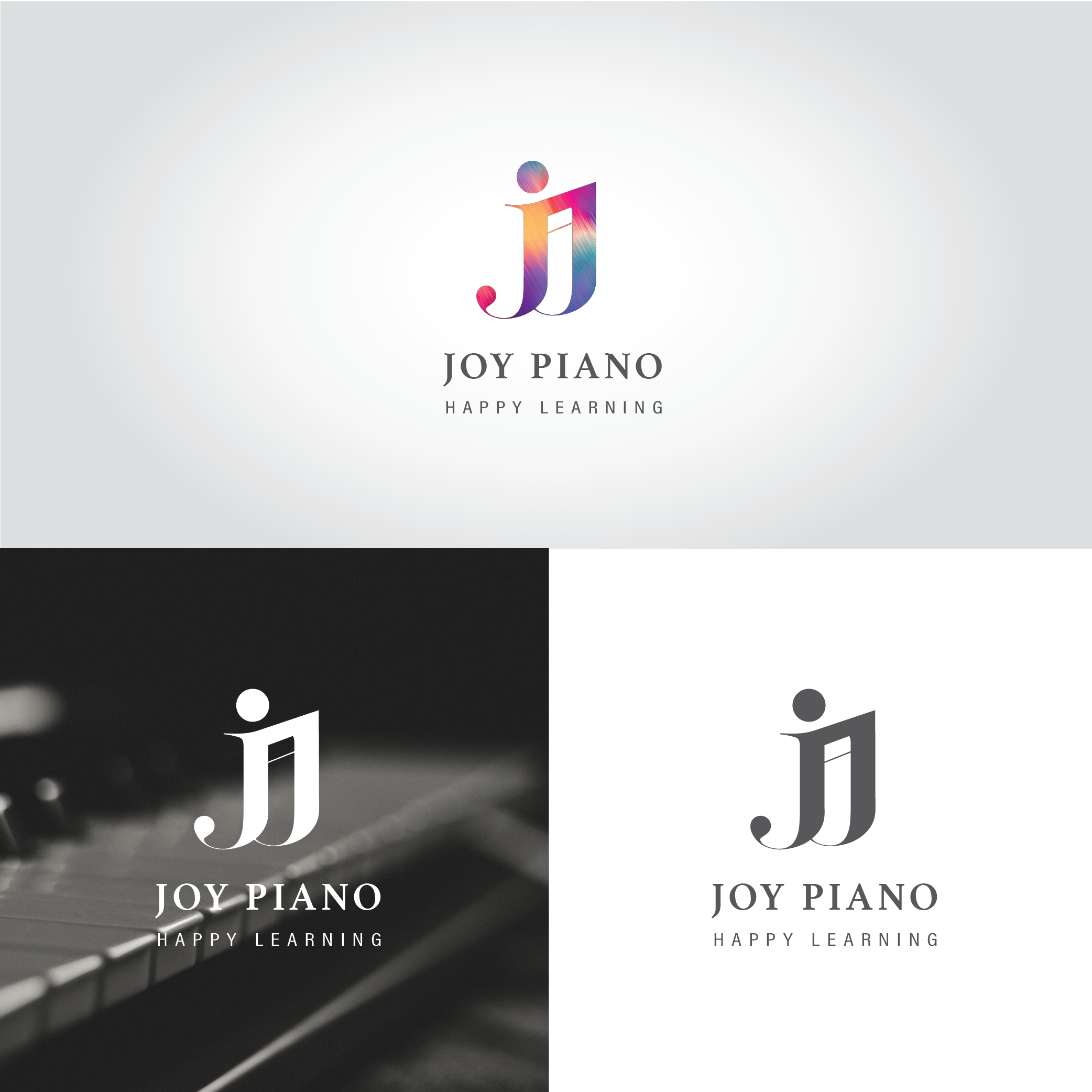
Branding, Logo Design: JOY Piano Studio
Design Concept: JOY Piano wants to convey a corporate image that is stable, professional, and trustworthy. However, the client also wanted to appeal to their main audience of children and students with a vivid and interesting image. To meet the client’s needs, I combined a stable font with musical notes and colorful flowing lines in the design. This created a visual that was both professional and engaging. Additionally, the design is easily adaptable for future related applications.
Photoshop/Illustrator
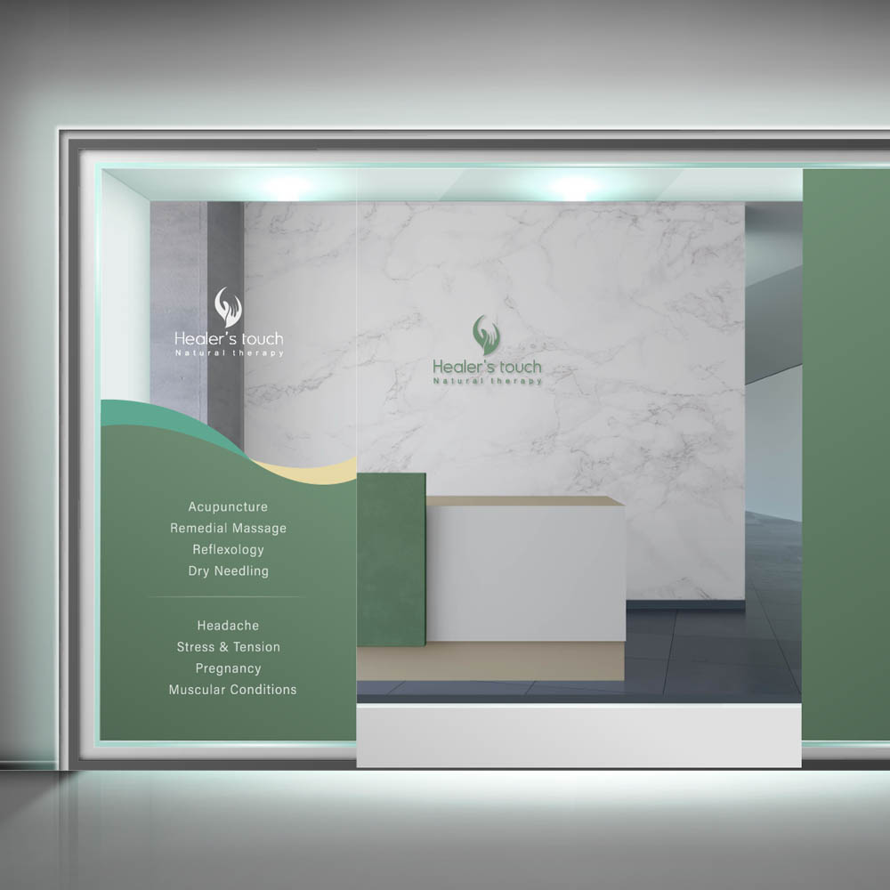
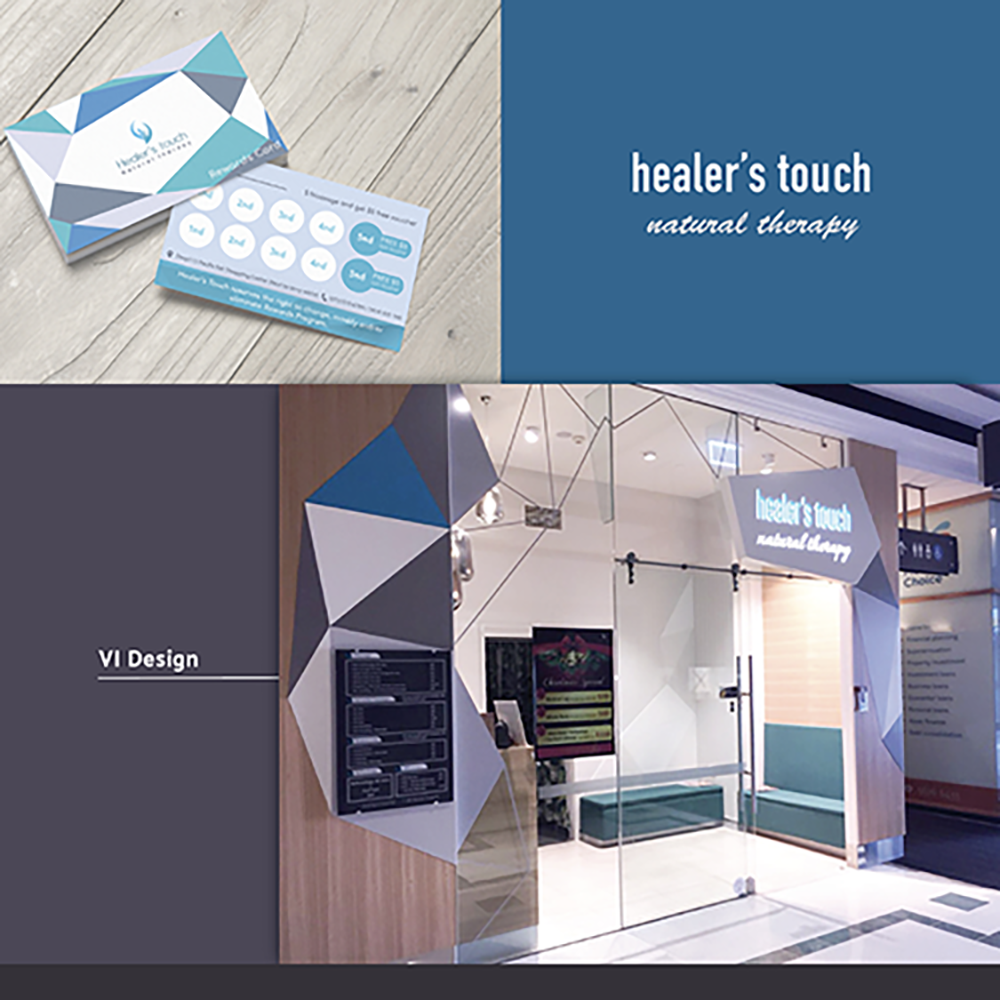
Storefront Design: Healer’s Touch
Design Concept: “Healer’s Touch” is one of my long-term clients. The focus of this design project was to create a color scheme and design wall advertisements for their flagship store. The client requested a certain level of privacy, so the sticker design was made to cover the position of the cash register. The logo was separated and cut out to improve the lighting of the store. The overall presentation of the design was based on the original brand guidelines.
Photoshop/Illustrator
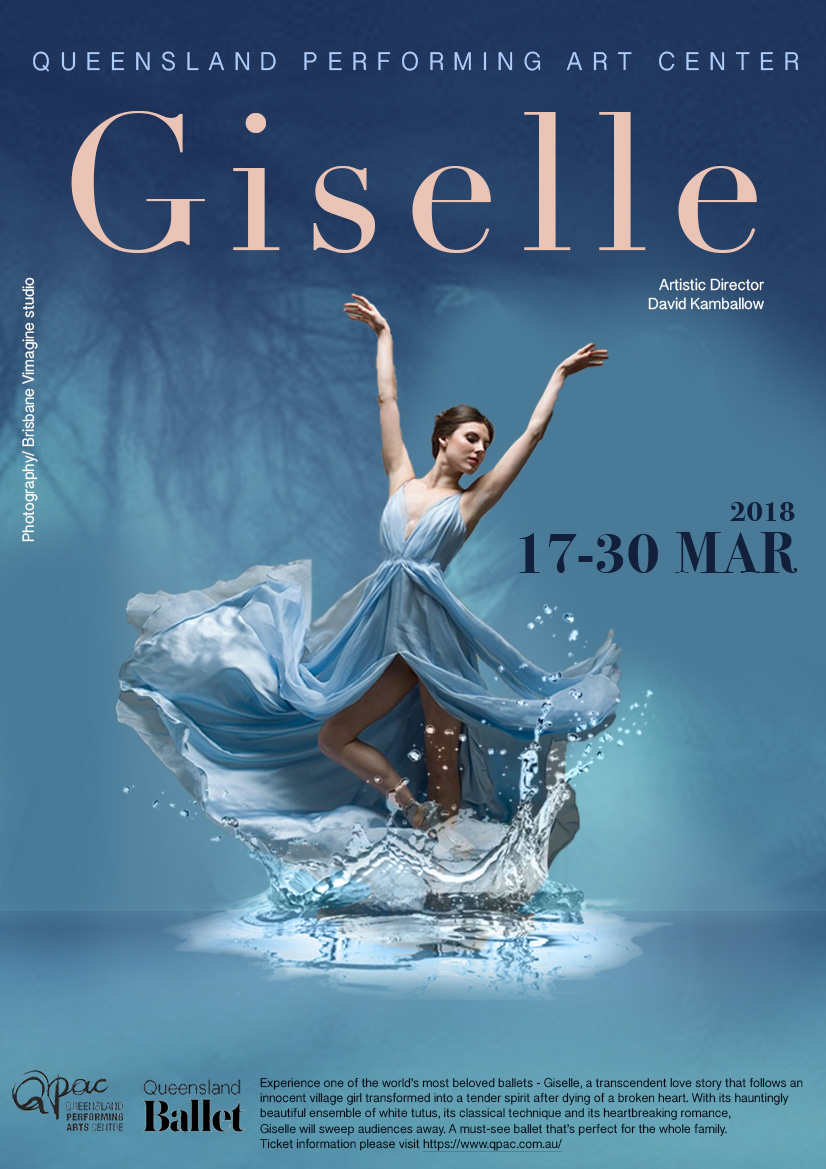
Poster Design
Design Concept: Ballet is an important part of my life, so I used Giselle as the theme for my poster design. For the image, I used tree shadows, water, and romantic yet gloomy colors to complement the dancer, showcasing this beautiful and tragic classic ballet. For the typography, I chose a more elegant font to present the information.
Photoshop/Illustrator
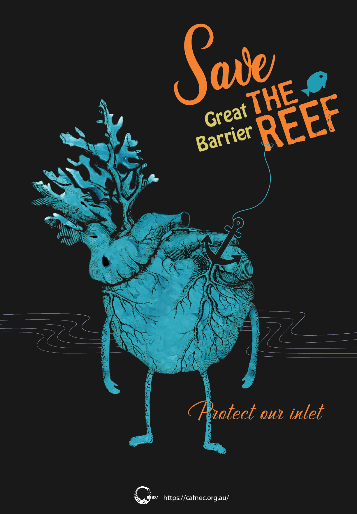
Poster Design
Design Concept: The Great Barrier Reef is one of Australia’s precious natural resources. I used illustration to show how abandoned and polluted vessels can harm our precious environment. If they could, they would also like to stand up for themselves and make their voices heard.
Photoshop/Illustrator
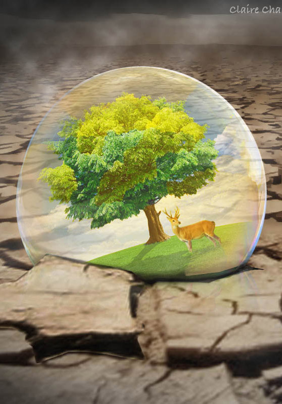
Photoshop manipulation
Design Concept: This design aims to raise awareness for environmental protection. Our beautiful environment is facing the threat of global warming, but those living in their safe bubbles may not realize the impending crisis.
Photoshop
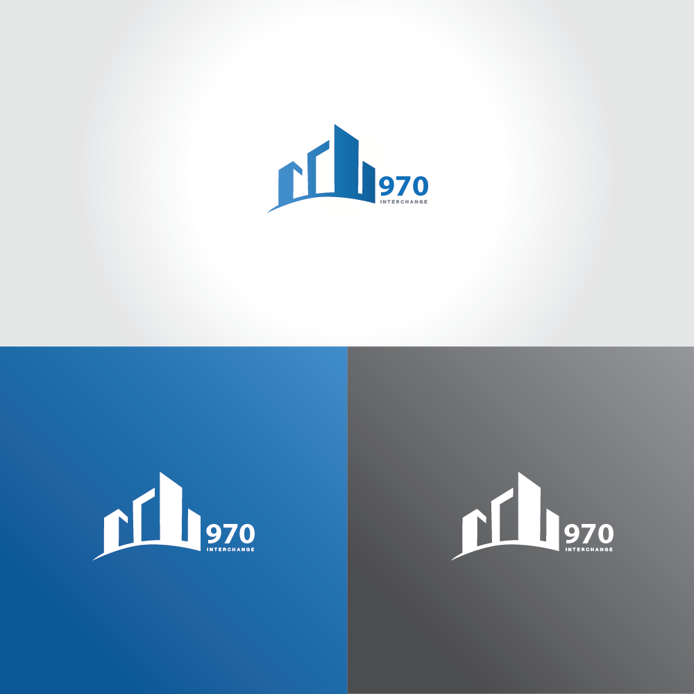
Logo Design: 970 real estate
Design Concept: I used a graphic of a inverted, 3D building viewed from below to convey the professional and trustworthy spirit of the brand. The color scheme of blue and gray was chosen to represent the company’s clear and professional values.
Illustrator
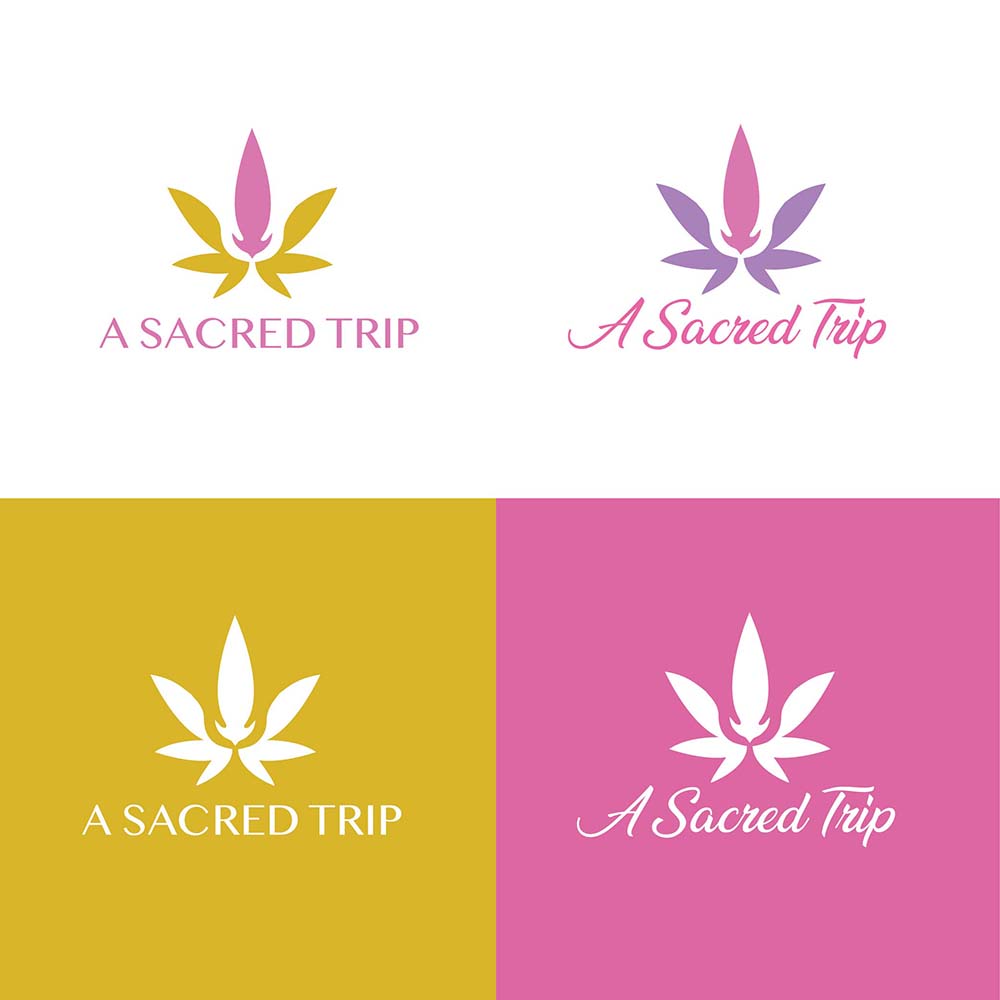
Logo Design: A sacredtrip meditation
Design Concept: I created a mirrored image of two hands joined together in a lotus flower shape to convey a sense of calm and healing. The colors chosen were pink and yellow to emphasize the brand’s message of natural healing, like the flowers of spring. Overall, the design aims to heal the mind and soul in a gentle and natural way.
Illustrator
Logo Design: Bambele Hike and Fly
Design Concept: To showcase the fun, friendly, and approachable characteristics of the brand, bright and bold color schemes and geometric shapes are used in the design.
Illustrator
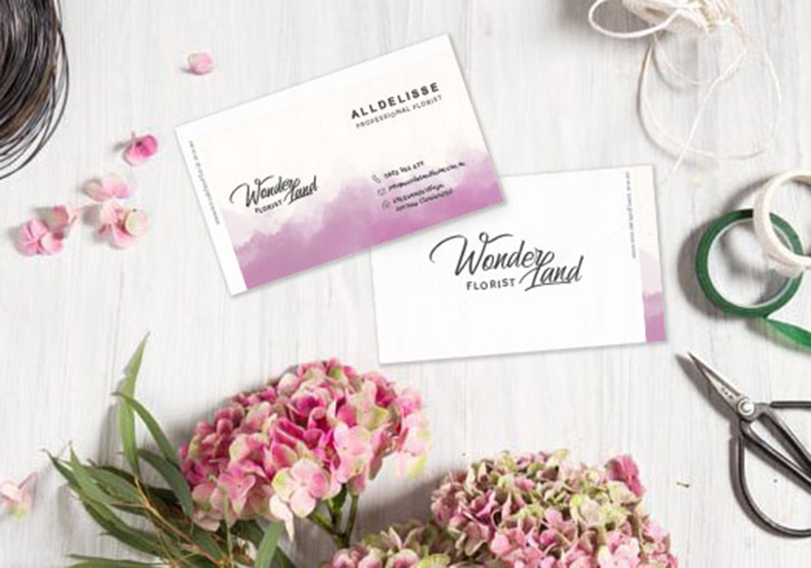
Business card, Logo Design: Wonderland Florist
Design Concept: The background design of the business card draws inspiration from the matte wrapping paper often used for flower bouquets, and is presented through a watercolor layering technique.
Illustrator
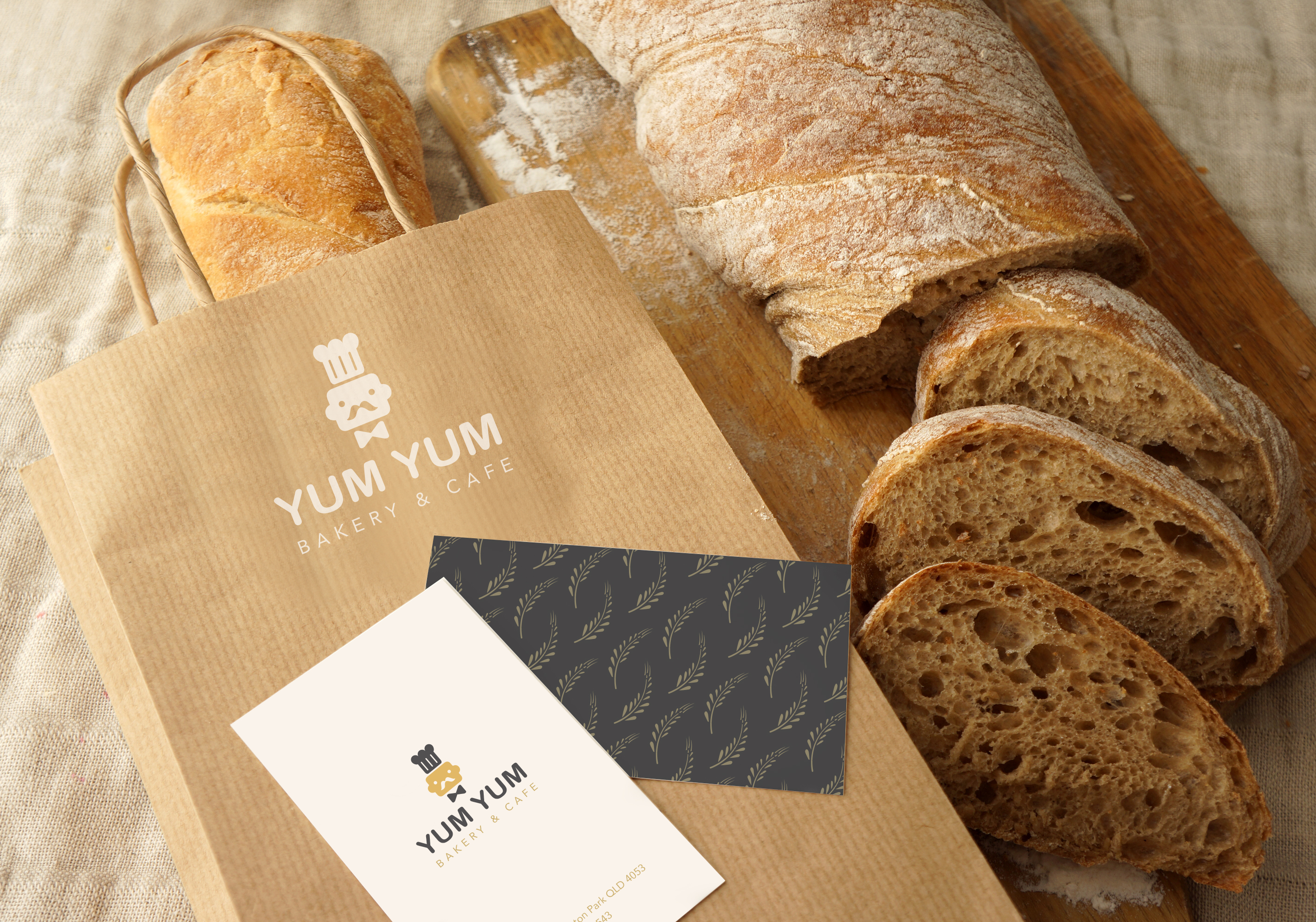
Logo Design: YumYum Bakery & Cafe
Design Concept: The logo design is inspired by a toast chef and features a simple and adorable character. The repeated image of rice ears is one of the extended patterns of the identification system and will be used on packaging in the future.
Illustrator
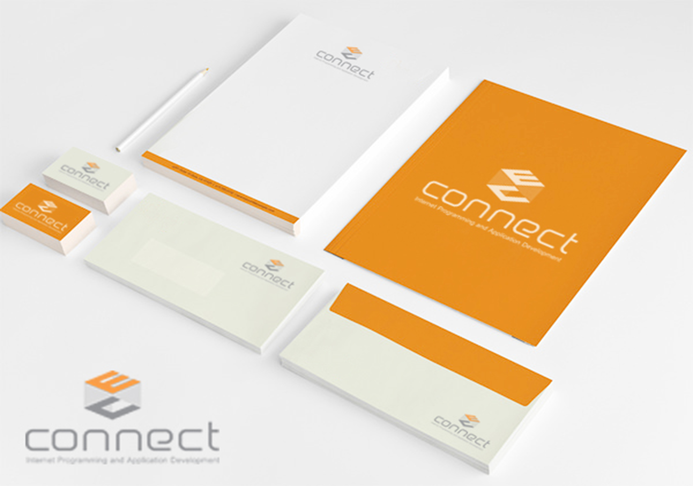
Logo and VI design: ECconnect Software
ECConnect is a provider of all-in-one provisioning, billing and client management solutions for telecommunication. The logo design utilizes a 3D cube to echo the company name and to showcase the perfect and professional service.
Illustrator
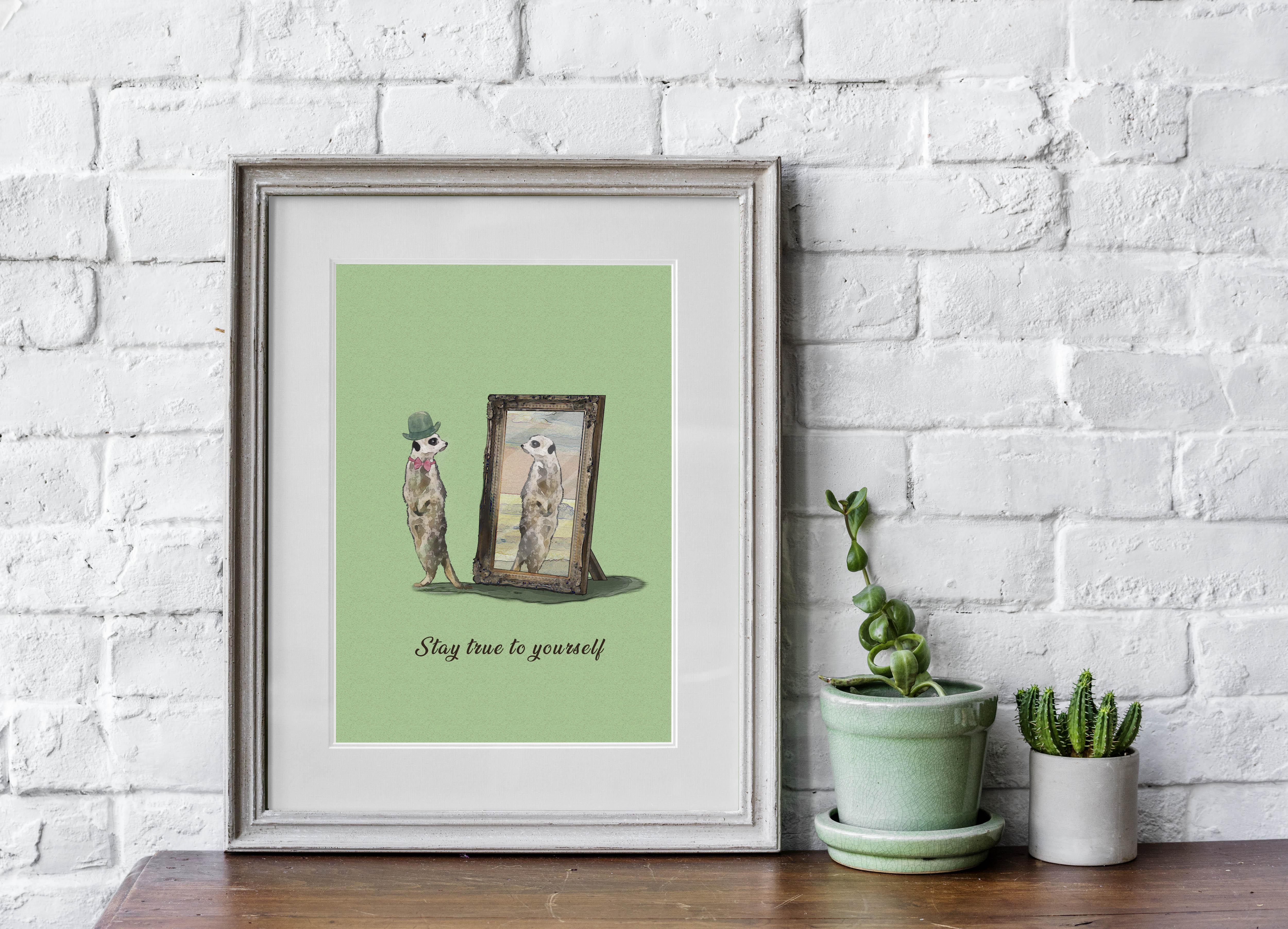
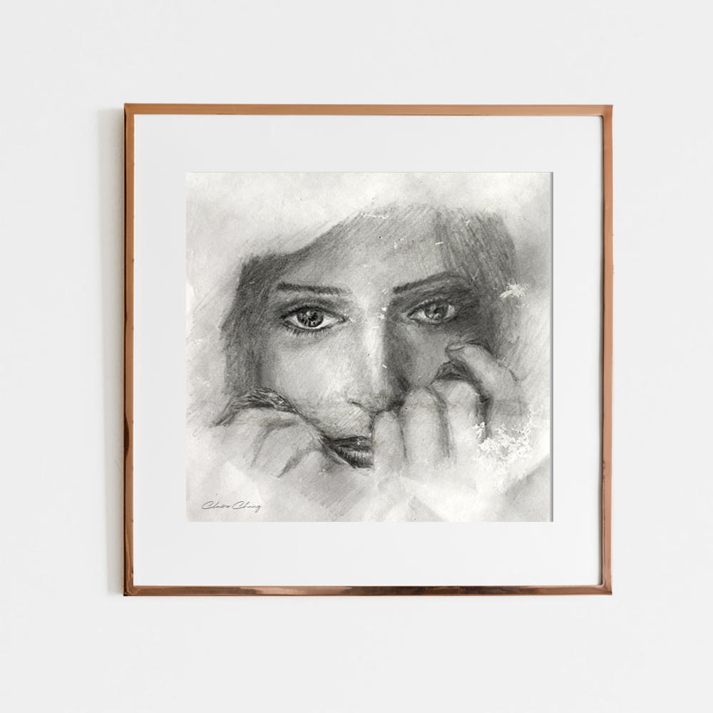
Illustration
Design Concept: In this era of advanced social media, people often lose themselves in the pursuit of creating an enviable image. This creative piece aims to convey the message that only by embracing your true self can you attract the right people and find true happiness.
Photoshop/Illustrator
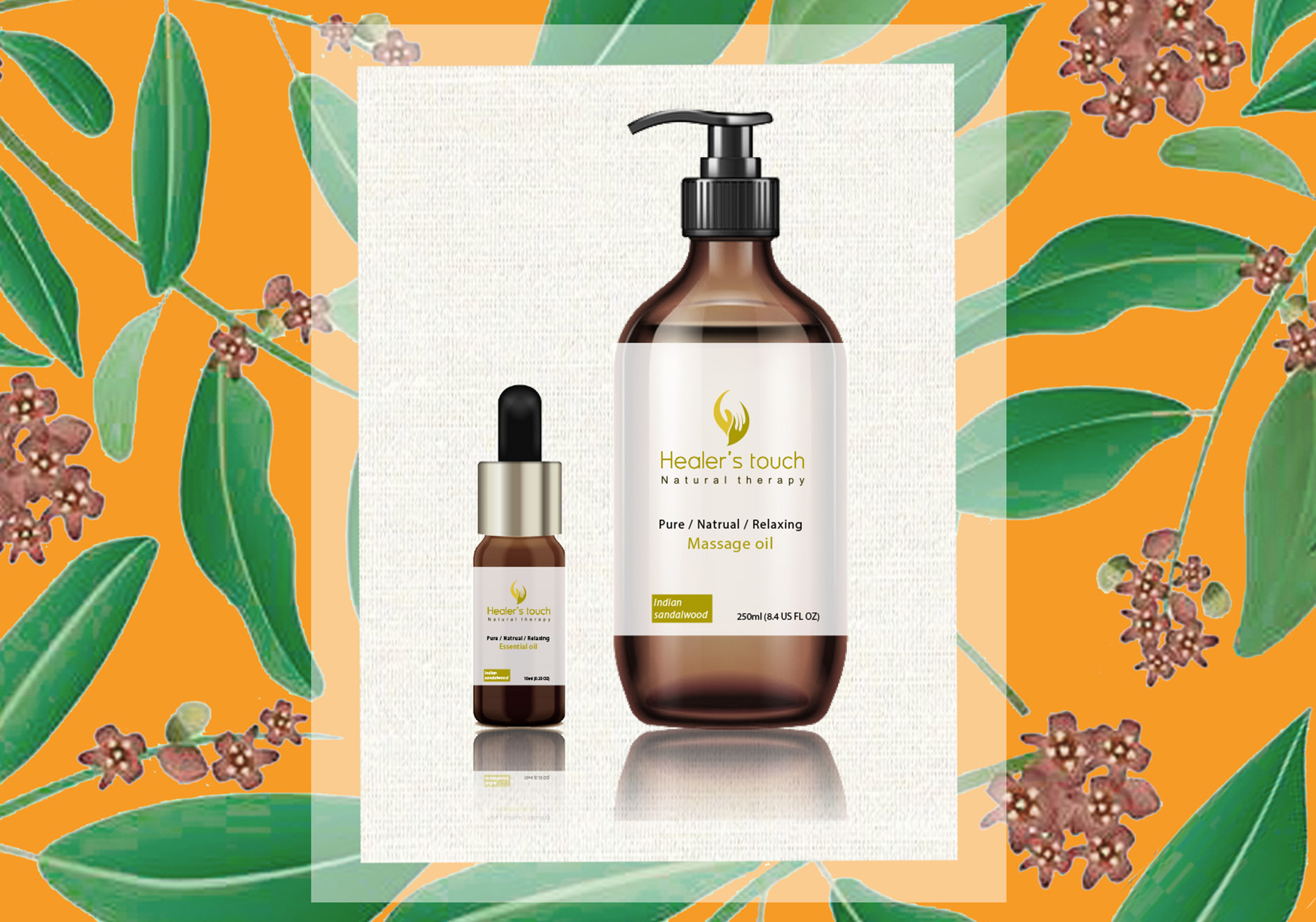
Label Design – Healer’s touch
Design Concept: For the brand’s essential oil design, I have selected eco-friendly bamboo-colored material for the container body, and the label design on the bottle body continues the brand’s color scheme with a clean and easy-to-read layout.
Illustrator
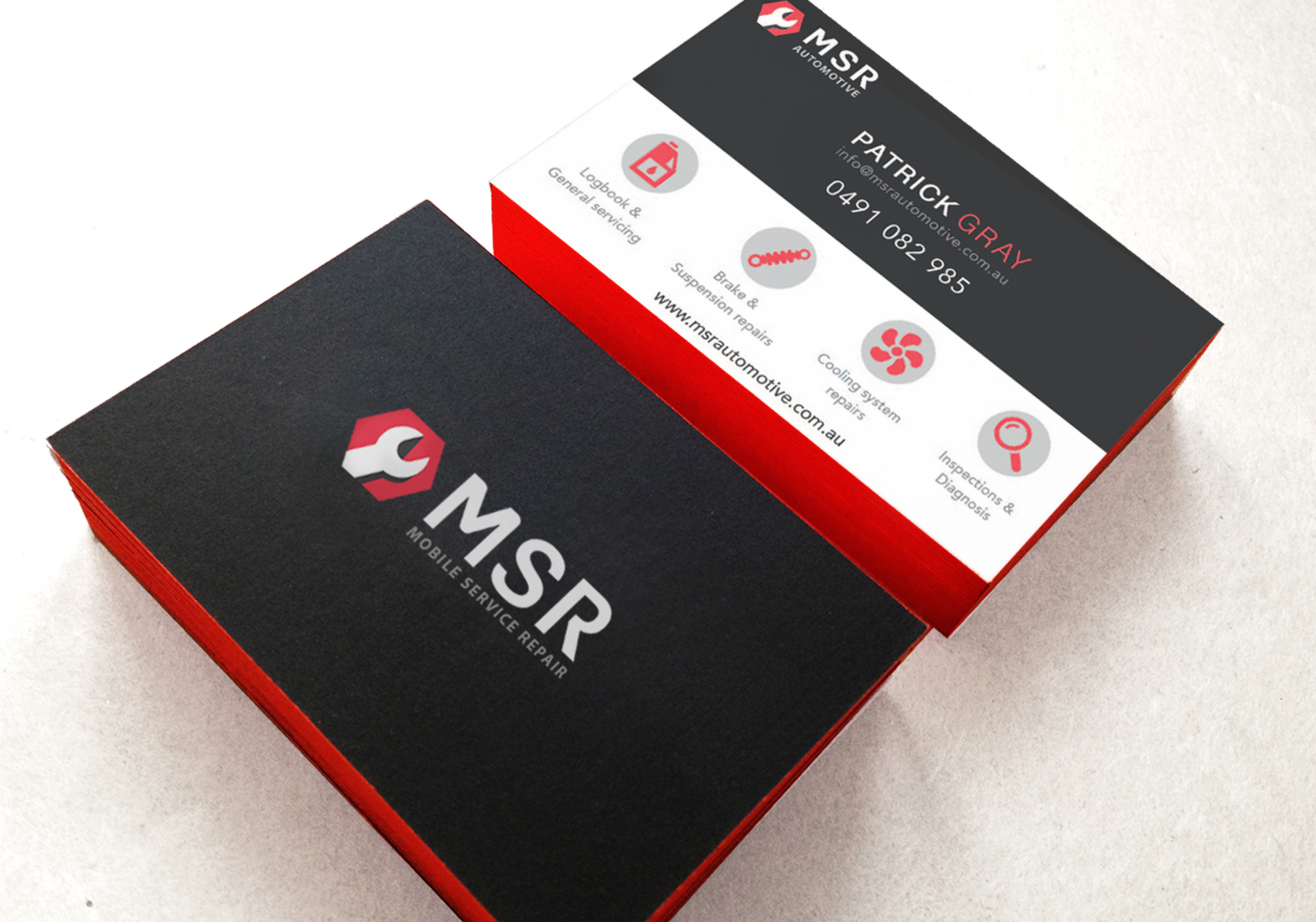
MSR AutoMOTIVE
Design Concept: The brand is represented by a combination of red and black, conveying a stable and passionate service-oriented image. The design features simplified versions of the tools commonly used by mechanics. The hexagonal shape symbolizes the six key values of the brand: satisfaction, professionalism, integrity, quality, security, and safety.
Illustrator
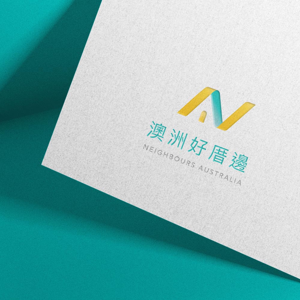
Logo Design
Design Concept: The brand aims to showcase its friendly and neighbourly service spirit through a design that combines the letter N with a house. The font is designed in italics to emphasize the company’s fast and effective services. This design is meant to convey a sense of approachability and warmth as if the company were your friendly neighbour always ready to help.
Illustrator
VI Design: Healer’s Touch
Design Concept: Hearler’s Touch is undergoing a new branding campaign as a result of expanding to a second location. The goal is to achieve a more modern and contemporary feel for the brand. The store design and new branding will feature a blue, white, and grey color scheme, with a modern touch added through the use of geometric color blocks. This cohesive design approach ensures that the store’s overall decor and branding align with one another.
Illustrator
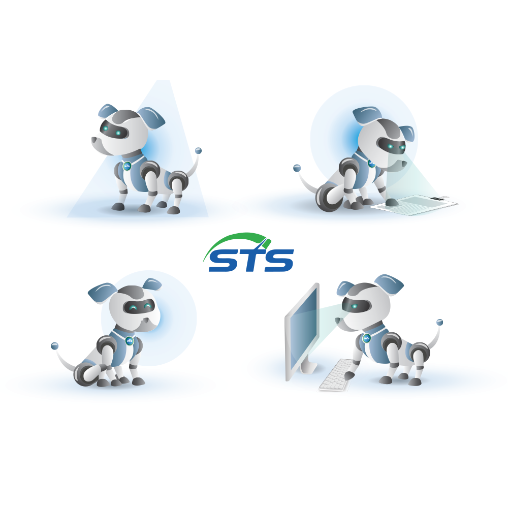
Watchdog Monitoring Software: Mascot Design
Design Concept: Watchdog’s mascot is designed to be sincere, cute, lively, and tech-savvy. The chosen design is that of a mechanical dog with animated and endearing movements. The color palette is composed of modern blue and white-gray tones to convey a sense of futurism.
Illustrator
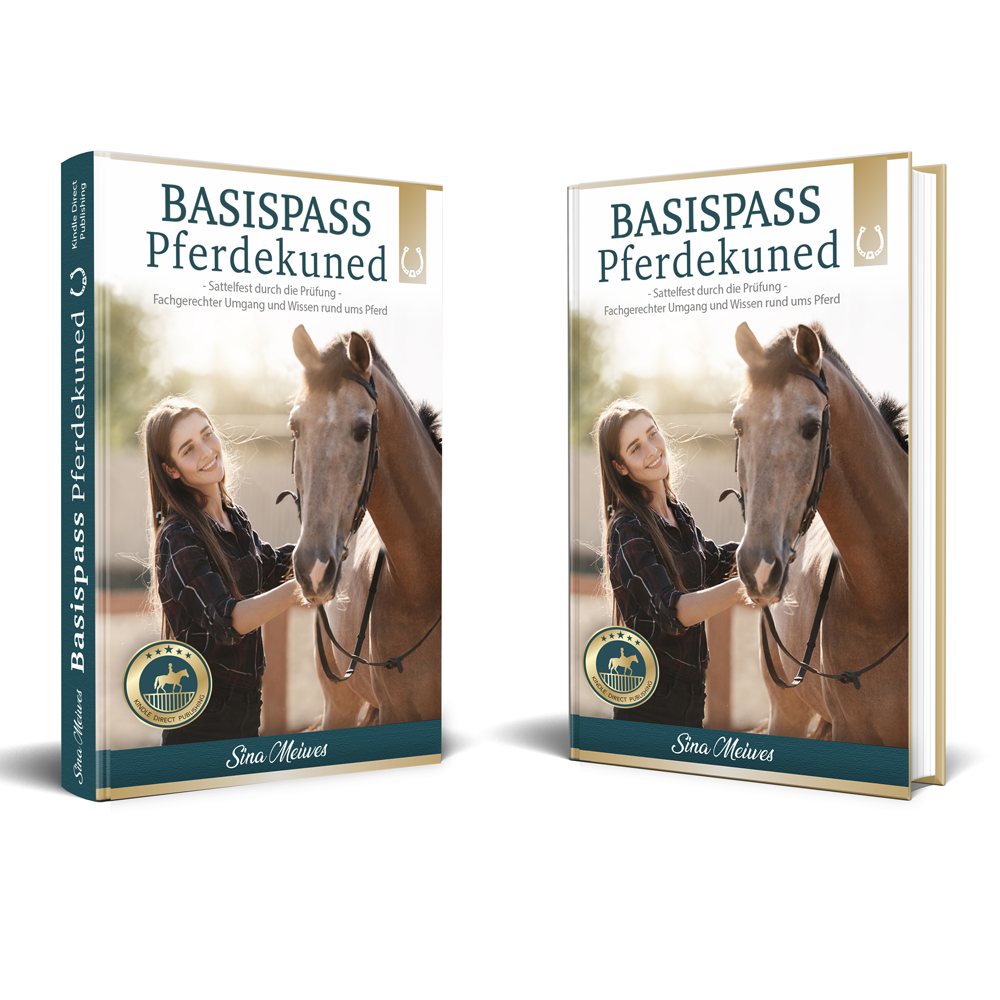
Book Cover Design
Design Concept: This is a book on horse care designed for equestrian enthusiasts. The client requested that the cover design exudes a classic and professional feeling with a sense of love for animals. Therefore, the image has been composited to depict a joyful woman lovingly caressing her horse in the sunlight. The layout arrangement is simple and neat.
Photoshop/Illustrator
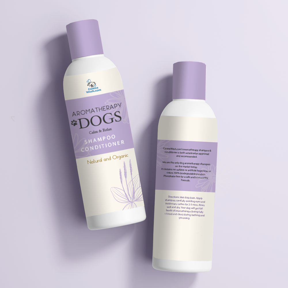
Bottle Label Design: Canine Wash Dog Shampoo
Design Concept: Using clean purple with pearl color to showcase the purity and cleanliness of the aromatherapy dog shampoo, with font arrangement that is clean and easy to read.
Illustrator
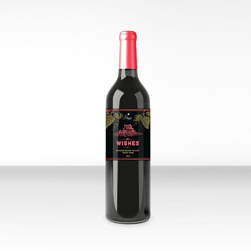
Label Design: Augest Winery – WishRed
Design Concept: Create illustrations to depict the winery, using a combination of pink and gold colors for the bottle and label to enhance the product’s quality and add a touch of luxury. The contrasting colors will make the product stand out. Choose a simple and elegant font design for readability and sophistication.